Crafted a personal brand narrative that visually expresses my Chinese cultural roots through a modern design lens, evident in the unique aesthetic of the logo, business card, and an engaging set of advertisements.
As you may know, my name is Ben and I love riding motorcycles, taking landscape photography and cooking (especially sushi).

I set out to design a identity for myself; a personal logo, business cards, advertisements, personal story and traits that align with a personal brand. I needed a brand image that conveyed my personal identity, paired with traditional & modern stylization, while differentiating from others using a clean, simple and effective design with cultural incorporation (Asian-American).
After I decided on a direction to build my brand story and identity, I began to reference from online sources that hosted a plethora of content relating to Asian culture. Stock sites, informational blogs and the work of others all came across my research sessions. In addition, I revisited past knowledge and experiences to recall what stood out. Things like objects, characters, symbols, art and more allowed me to further decide what seemed reasonable for my brand story. I decided to mix symbolism and stylization to ensure my culture is understood amongst viewers of various backgrounds.
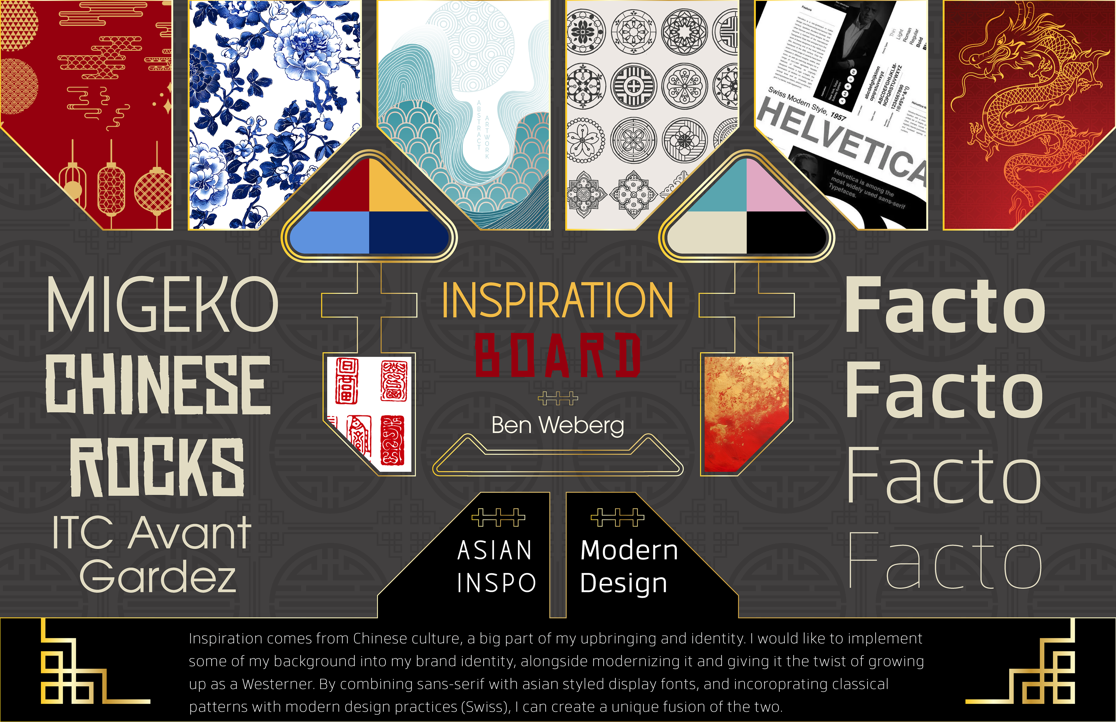
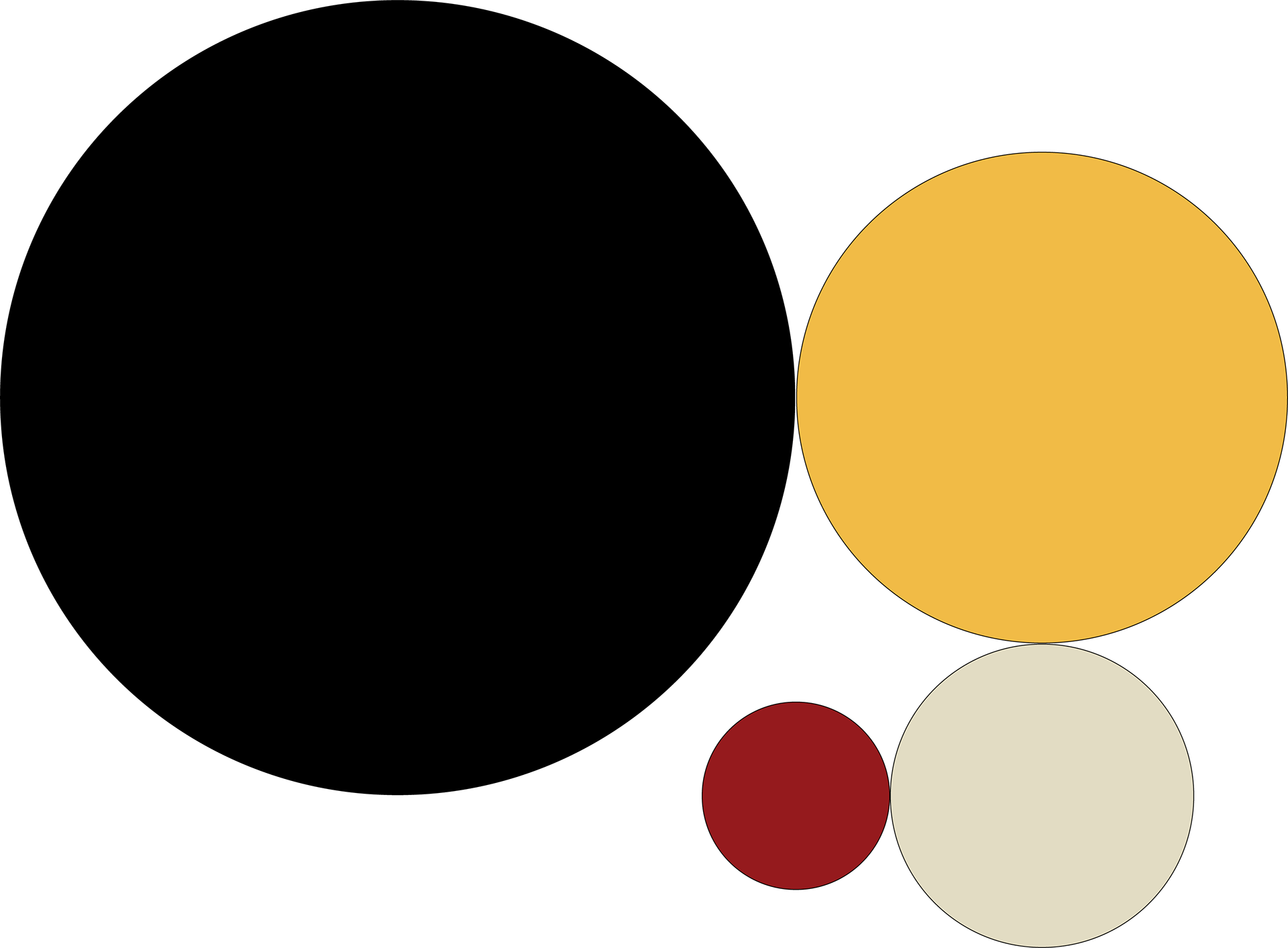
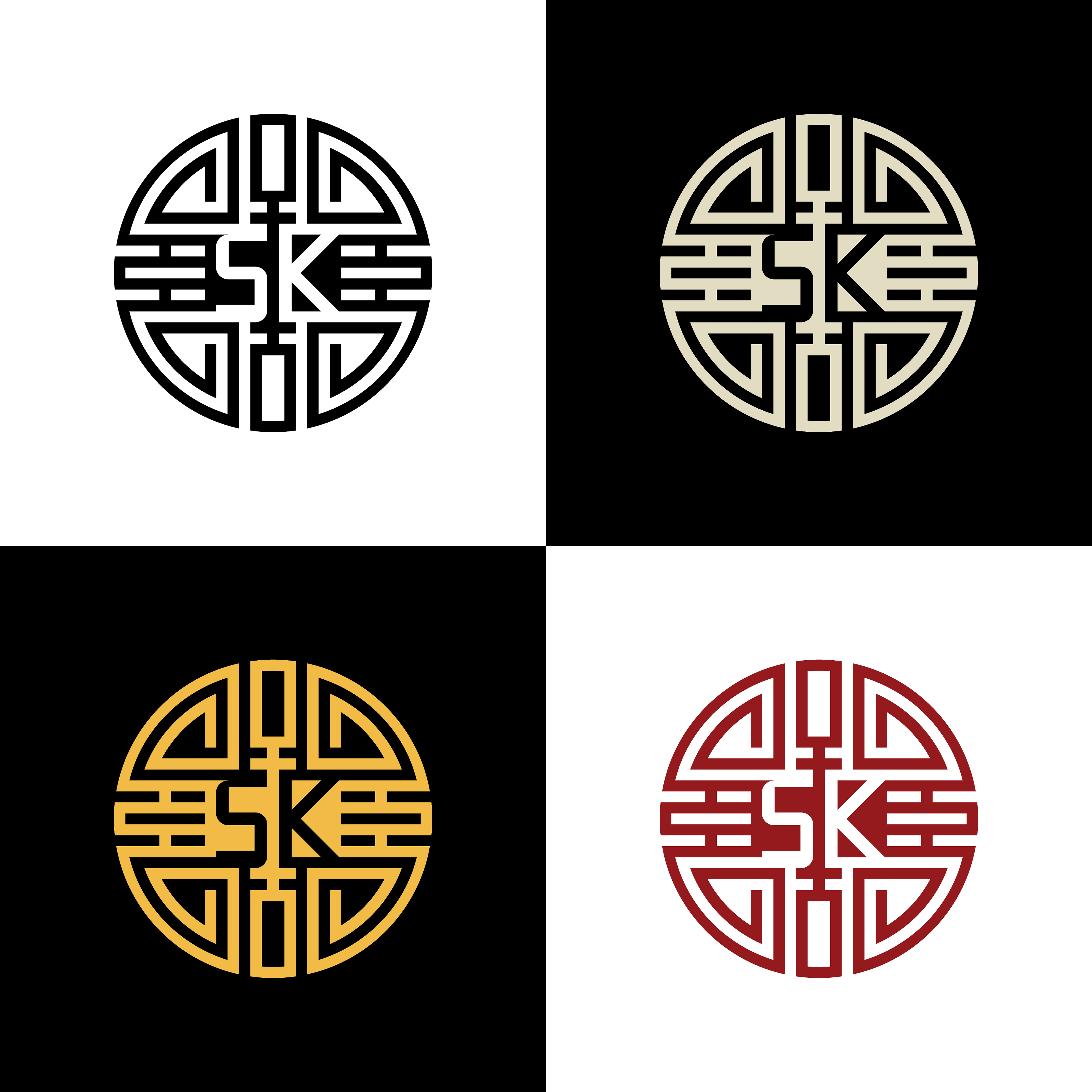
For the color palette, I chose the traditional yellow and red Chinese colors they are known for with black & ivory as supporting bases. I simplified to the most logical colors that I sampled when researching and developing a moodboard. As per the palette, yellow is the primary and represents royalty and prosperity while red serves as an accent, signifying luck and joy.
When designing a logo, I referenced both modern & traditional elements seen in Chinese culture alongside themes and styles that I felt represented me the best.
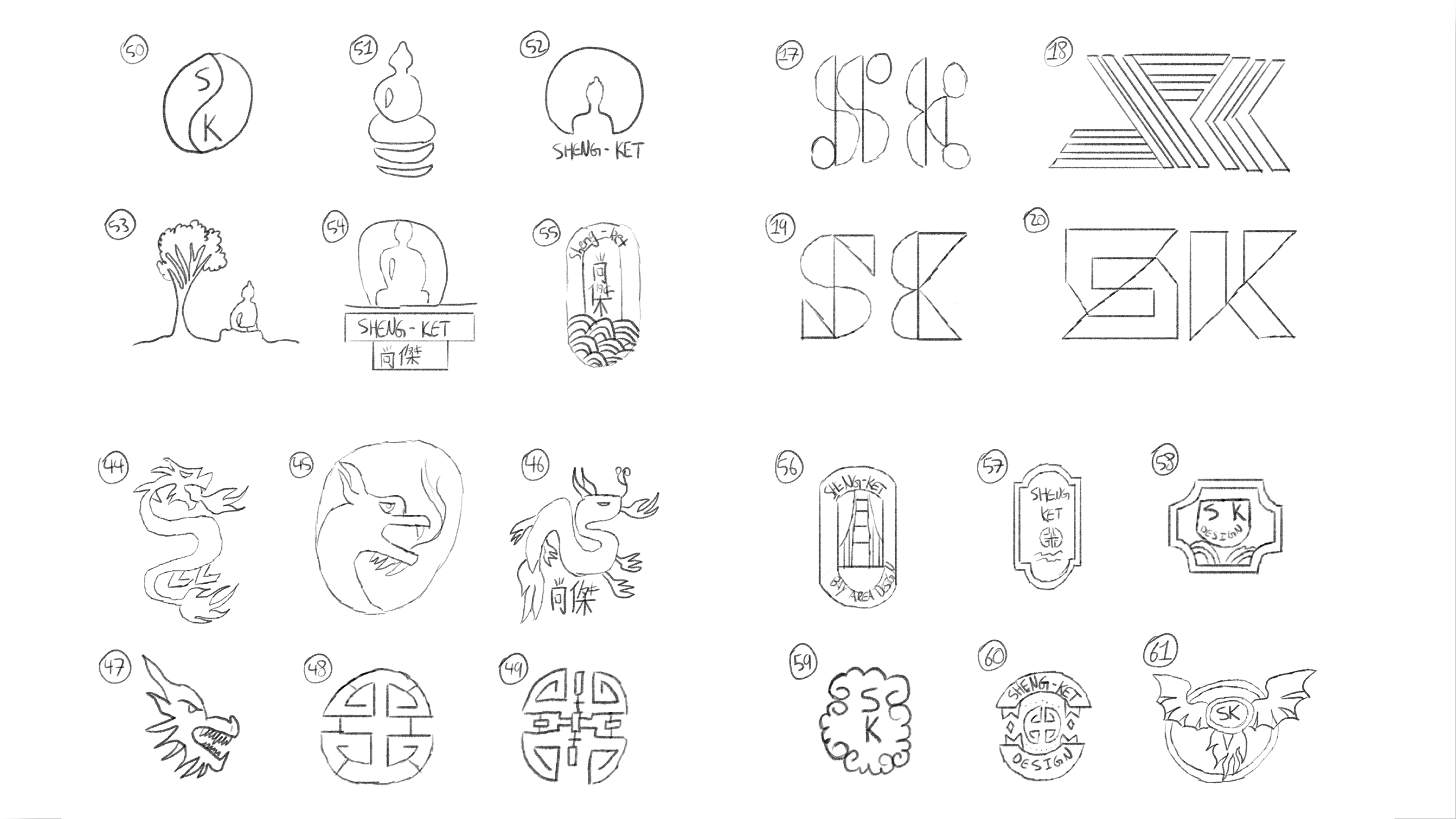
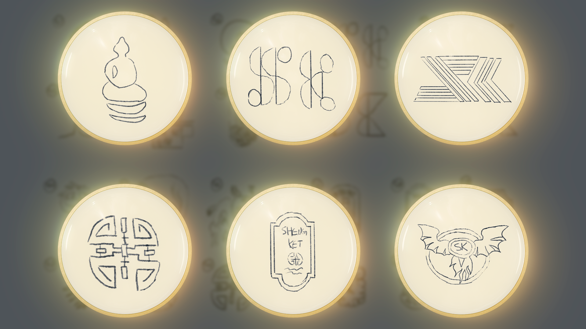
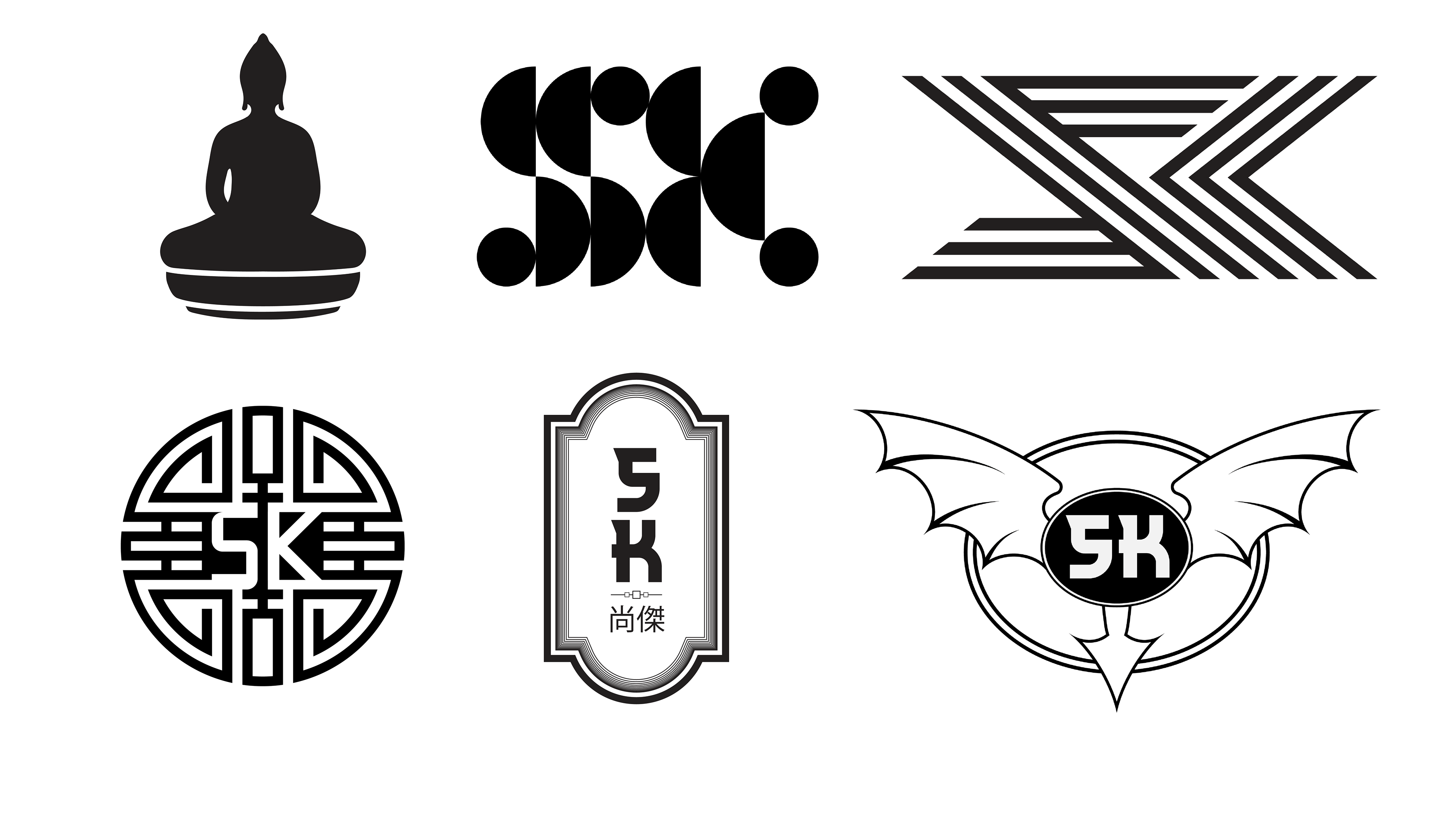
I came across many symbols and graphics, but the one that stuck was the symbol of wealth. The symbolism and unique design features were very eye-catching while aligning with the underlying brand story, serving wealth in collaboration. I decided to implement my initials into the center of the symbol to further personalize its identity. The letters that make up the initials were built on the same 52X52 grid as the logo. All spaces and lines are 2 grid units, including the initials. It is symbolically understandable, with complex with symmetrical detail that correlates with Chinese tradition & modern design.


When I began the design stage for the business cards, I referenced successful designs online. I incorporated traditional elements and shapes to give the design character that parallels my brand. Some shapes were boxier and sharper, while others were rounder. This design choice plays off the characteristics of my logo. To stylize, I stuck to asian and Swiss-American stylization by using the colors, typefaces and layout to further accentuate the brand image. The type was scaled larger than the research samples to ensure clear, easily readable information while the following a simple layout to efficiently display information. In the ideations and the final choice, I let the symbol (logo) speak
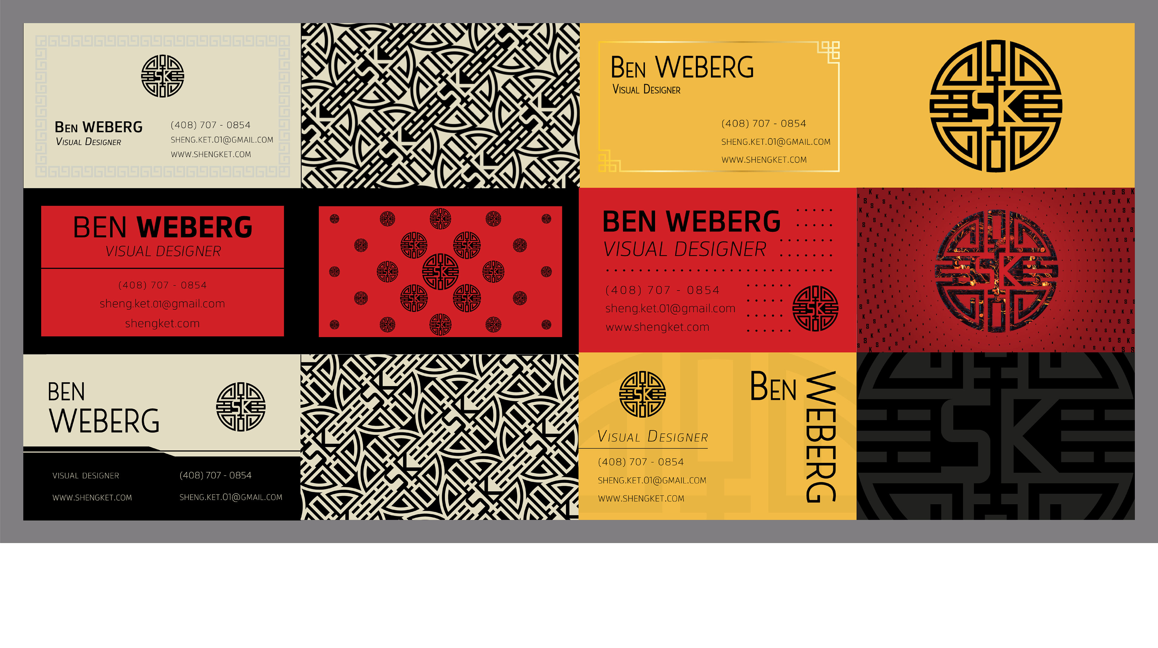
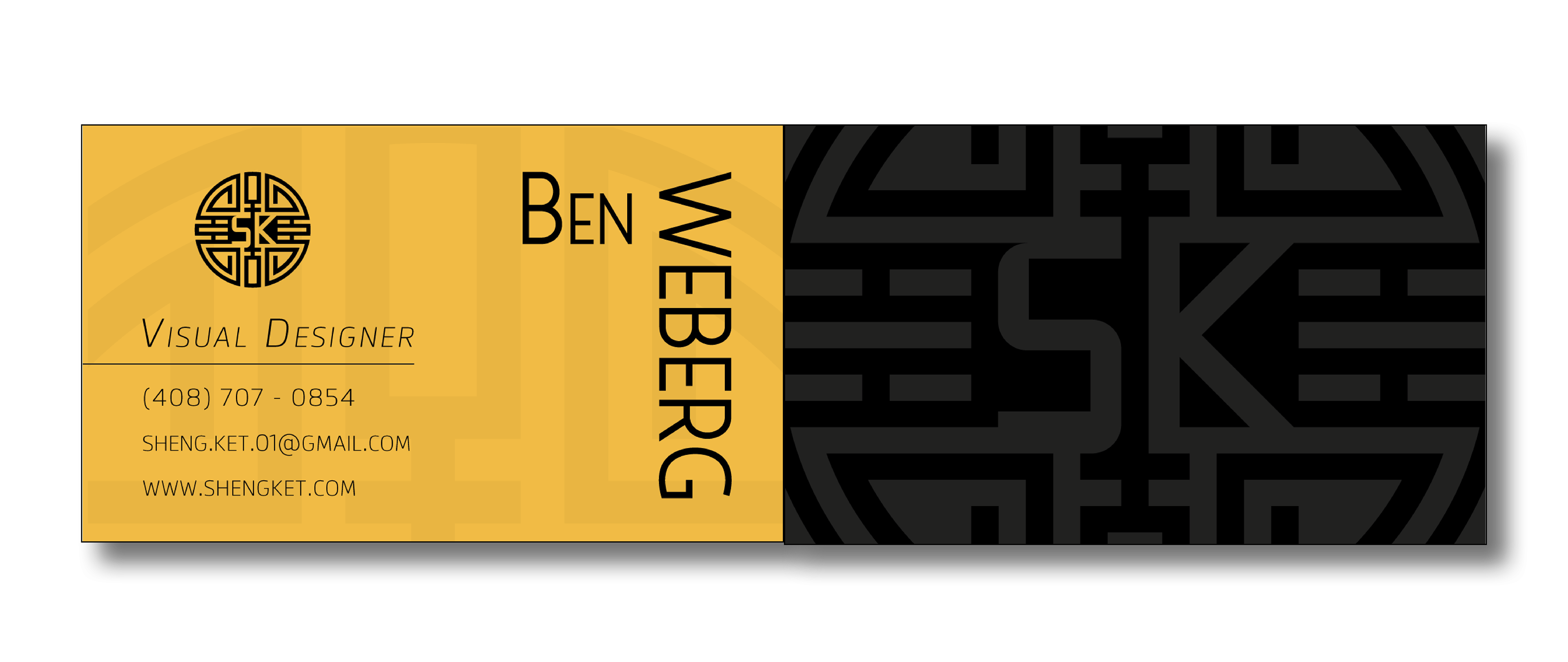
The final card uses a unique, visually pleasing layout with raised spot UV on my name and spot UV on the backside logo.
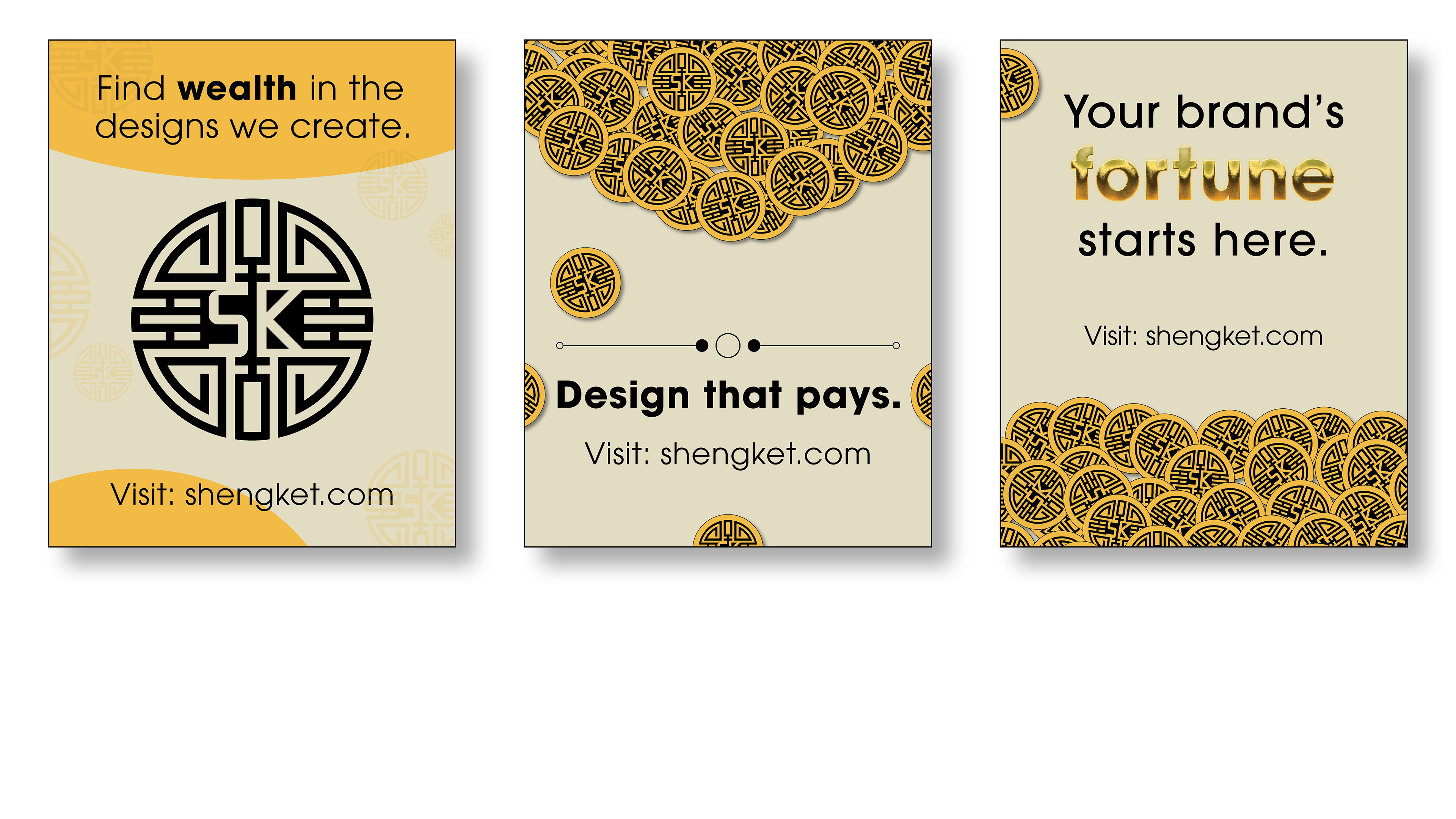
For an advertisement, I browsed Instagram posts to gain a understanding for what other individual entities were doing. I chose to keep the layout simple with a illustration, tagline and call-to-action. I utilized visual texture and the brand logo to standout, kept the text simple and quickly readable and accounted for small screen sizes by ensuring the type was scaled appropriately. I included a catchy, quick message for viewer with some being direct while others had allusion or a figure of speech.
After completing the project, I developed a deeper understanding of brand identities and their stories. I improved ideation variety when finding the correct solution, and found better reasoning when narrowing down on the final product. At times, it’s okay to keep it simple.